Design System

How Jarvis looks and behaves — one place for the rules that keep the app, the documentation site, the screenshots and the release videos recognisably the same product. It is written for contributors and for AI coding agents.
Binding levels. MUST is required — a change that breaks it is not merged. SHOULD is the default; deviate only with a reason in the PR. MAY is optional. Most MUST rules are enforced by a test or a check; the last section lists them.
Principles
Jarvis is the cockpit you open when an alert comes in and you need to act. The design serves that moment.
- Operational clarity — MUST. The state of an alert (firing, suppressed, resolved, claimed) is readable at a glance and never carried by colour alone.
- Density over decoration — SHOULD. Show more alerts, not more chrome. The product UI stays compact; the documentation site and media may be more spacious.
- Calm under pressure — SHOULD. Motion explains a change; it never decorates and never loops for its own sake.
- One meaning, one look — MUST. The same fact looks the same everywhere: one colour, one shape, one component per meaning.
- Open and inspectable — SHOULD. Fonts are local and licensed; no external font or icon CDNs (the strict CSP depends on it).
Logo
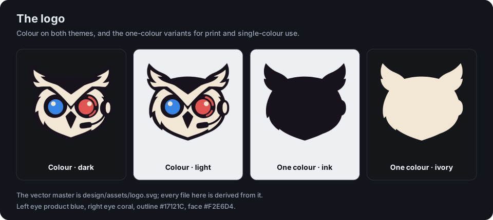
The mark is an owl wearing a headset: a dark outline, a warm ivory face, a blue left eye and a coral right eye. The two eyes are the two brand colours.
The vector master is design/assets/logo.svg (outline #17121C, face #F2E6D4, left eye #3786E6, right eye #E05552). Everything else is derived from it by scripts/logo-assets.py: logo.png (1024 px, transparent), the 16 and 32 px favicons, favicon.ico, the touch icon and the two one-colour variants — ink for light backgrounds, ivory for dark ones.
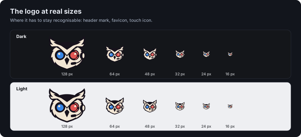
- MUST use the canonical files. Never resize, recolour, stretch, rotate or add effects to the mark; derive a new size from the master.
- MUST stay recognisable at the target size — down to 16 px both eyes and the ear tufts still read.
- SHOULD keep clear space of at least one eighth of the mark's width on every side, and use the mark alone (no wordmark) in the app and in favicons.
- SHOULD use the one-colour variants only where colour is not available (print, embossing, single-colour merchandise).
- On the dark app background the dark outline merges with the surface; the eyes and the ivory face carry the silhouette. If a screenshot review shows the shape is lost at some size, add a light keyline variant rather than changing the mark.
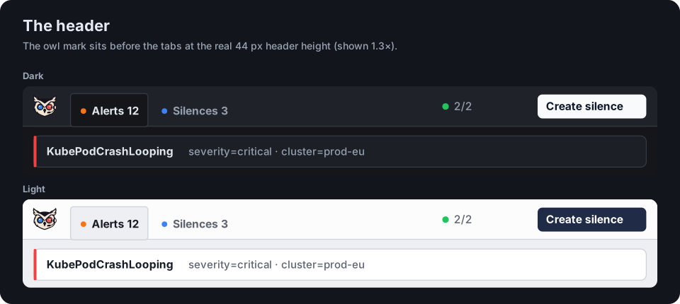
The header mark. A 28 px owl mark sits permanently at the left of the header, before the navigation tabs, so the product is identifiable at a glance. It is decorative (alt="", aria-hidden) and not a link, so it adds no accessible name next to the navigation buttons.
Colour
Colour has four layers. Keep them separate.
| Layer | Purpose | Members |
|---|---|---|
| Neutral | Surfaces and text | background, card, header, popover, input, muted, accent, border, foreground |
| Brand | Identity, used sparingly | product blue, coral |
| Status | Alert and system meaning | critical, warning, info, neutral, success, attention, claim |
| Interaction | State of a control | link, focus ring, field edge, selected |
One source of values
Every colour and radius value lives in design/tokens.json. node scripts/design-tokens.mjs generates from it the app's Tailwind theme (frontend/src/generated/tokens.css), the documentation site's variables (website/.vitepress/theme/generated-tokens.css) and the hex constants of the video cards (frontend/e2e/video/generated-theme.ts). Never edit a generated file; the pre-commit hook and CI run the script with --check.
Components use the semantic Tailwind utilities — bg-card, text-muted-foreground, border-control, bg-critical-soft. They MUST NOT use a raw palette class (text-red-400), a hex or an rgb() literal. dark: follows the app's own theme (data-theme), not the operating system.
Neutrals
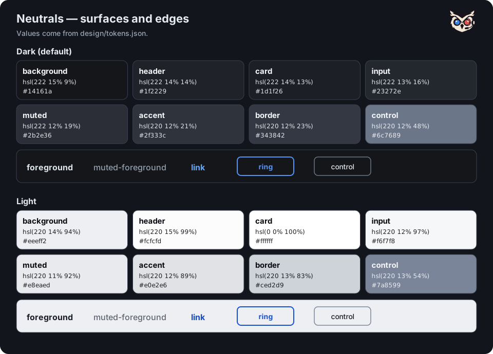
Surface depth in dark runs background 9 % → card/header 13–14 % → input 16 % → muted 19 % → accent 21 % → border 23 %. The header is deliberately lifted further than that step so the toolbar reads as its own surface. Saturation stays at 12–15 % to avoid an "electric navy" look. Light mirrors the chain: background 94 %, header 99 %, card 100 %.
Brand
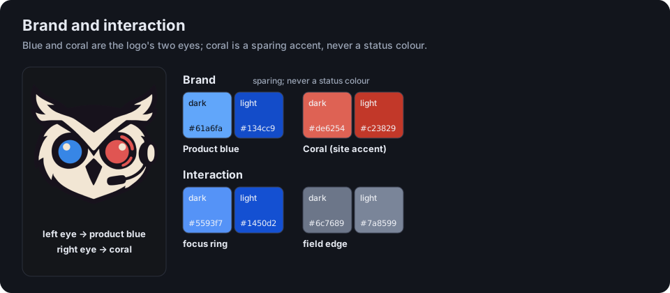
- Product blue is the colour of links, focus and selection — the product's interaction colour and the logo's left eye.
- Coral (the logo's right eye) is a brand accent for the documentation site and media. SHOULD stay sparing: a tagline, an underline, a cover. MUST NOT stand in for a status colour — coral is not "critical".
Status roles
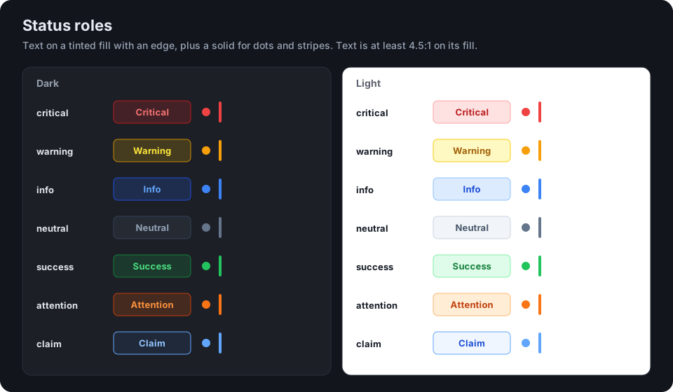
Each role is text (-fg) on a tinted fill (-soft) with an edge (-edge), plus a solid (-solid) for dots and stripes. The same role means the same thing in every component and in both themes.
| Role | Means |
|---|---|
critical | Critical severity, firing alert, down instance, offline |
warning | Warning severity, expiring silence, modified filter, hints |
info | Info severity, the Silences tab |
neutral | No severity, suppressed, pending silence |
success | Resolved, healthy instance, active silence |
attention | Unprocessed alert, error severity, the Alerts tab |
claim | Someone is handling this alert |
selected is the fill of a selected row. A new state gets its own role — blue must not pick up another meaning.
- MUST carry state in text or shape as well: badges say "Critical", "Warning", "Info"; the stripe on a card is a redundant cue, not the only one.
- MUST NOT branch on the theme in a component to choose a colour; the token already differs per theme.
Contrast
Target is WCAG 2.2 AA: 4.5 : 1 for normal text, 3 : 1 for large text, UI boundaries and state indicators. Measured from the tokens:
| Pair | Dark | Light |
|---|---|---|
foreground on background | 14.4 : 1 | 14.9 : 1 |
muted-foreground on background | 6.8 : 1 | 5.2 : 1 |
muted-foreground on card | 6.1 : 1 | 6.0 : 1 |
muted-foreground on input, muted, accent | ≥ 4.5 : 1 | ≥ 4.5 : 1 |
link on background | 7.2 : 1 | 6.3 : 1 |
ring on background / card | 6.0 / 5.4 : 1 | 5.9 / 6.8 : 1 |
control on background / card | 3.9 / 3.6 : 1 | 3.2 / 3.7 : 1 |
any role's -fg on its -soft | ≥ 4.5 : 1 | ≥ 4.5 : 1 |
- MUST keep
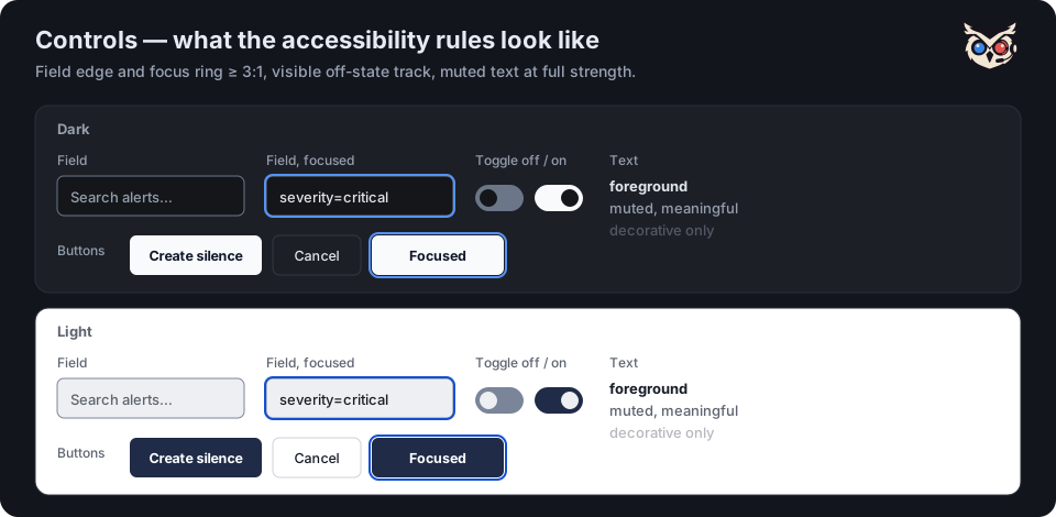
muted-foregroundat full strength for text that carries meaning. It reaches 4.5 : 1 on every surface it sits on, including inputs, chips and hover fills; stacking/60or/70opacity on top drops it below AA. Opacity is for decoration only (separators, placeholders, hover-revealed affordances, disabled states). - MUST give the edge of a text field or select at least 3 : 1 — use
border-control. Cards, header and tables keep the quietborder, because there the edge is not what identifies the element. - MUST give icon-only controls (pin, drag handle, info hint) and the off state of a toggle at least 3 : 1. A button with a visible text label does not need a high-contrast edge; the label identifies it.
frontend/src/lib/themeTokens.test.tsasserts the focus ring, the field edge,muted-foregroundon every surface and every role's text contrast in both themes. Add new token pairs there.
Semi-transparent combinations outside the tokens (bg-foreground/95) are not covered by that test; measure them in the browser on the rendered result.
Typography
- Inter is the face of everything in the product UI and of the documentation site's body text. The app bundles it (
public/fonts/, a Latin subset of the official variable font, 100 KB, SIL OFL with its licence beside it) and preloads it; the docs site gets it from the VitePress default theme. No font CDN. - Sora (self-hosted, SIL OFL) is the documentation site's display face — hero and feature titles only. MUST NOT be used for body copy or UI chrome.
- Monospace is for label matchers, code, IDs and versions only, from a fixed stack (
ui-monospace, 'SF Mono', Menlo, Consolas, 'Liberation Mono'), so screenshots do not depend on one platform. - Size roles. The product is compact; sizes are roles, not one-off values.
| Role | Size | Use |
|---|---|---|
| caption | 10–11 px | Redundant metadata only (counts, secondary time) |
| meta | 11–12 px | Secondary lines, chips, table cells |
| body-compact | 12–14 px | Default product text |
| body | 14–16 px | Detail panel prose, documentation |
| title | 16–20 px | Panel and page headings |
| display | 28 px and up | Documentation hero |
SHOULD use 10 px only for information that is repeated elsewhere. Do not invent sizes such as text-[10.5px]; take the nearest role.
Spacing, shape and depth
- MUST build on the 4 px grid (Tailwind's scale). The product is compact (rows around 28–36 px); the documentation site and media are comfortable. State which one a new surface belongs to.
- Corner radii are roles, not values:
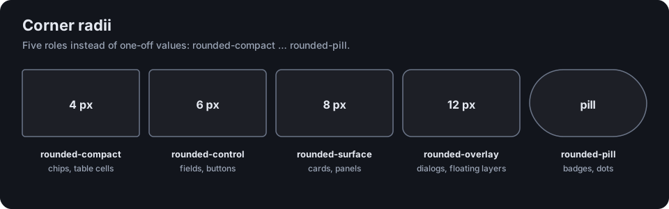
Use rounded-compact|control|surface|overlay|pill; a raw rounded-md is rejected by the drift check.
- SHOULD use shadows only to show a change of layer (
shadow-smon cards, a larger shadow on overlays). No glows in the product UI; media may use a stronger shadow for depth.
Icons and illustration
- MUST use Lucide with the default 2 px outline for product UI. Do not mix in another icon set or filled icons.
- MUST give every icon-only control an accessible name (
aria-label). - The owl logo and the owl mesh are the brand illustration. The mesh geometry is shared between app and website (
frontend/src/lib/owlMesh.ts, sampled fromlogo.png); reuse it, do not redraw it. It MUST stop underprefers-reduced-motion.
Components and states
Use the primitives in frontend/src/components/ui/: Button, Input, Select, Textarea, DateTimePicker, Card, Badge, Avatar, Tooltip, InfoHint, Popover, Dialog, Sheet. MUST reuse a primitive before writing a new control, and cover every state a control can be in: default, hover, focus, active, disabled, loading and error.
Status banners above a list (refresh failed, stale cluster, live connection interrupted) use the status roles: critical when data is missing or a request failed, warning when data is old or degraded. They carry text, not only colour. An error MUST NOT fall through to the empty state — "No alerts" claims an all-clear that failed data cannot support.
Every clickable element MUST show cursor: pointer (set globally in index.css), and every view MUST handle loading and error.
Overlays — one primitive per role
| Role | Primitive | Behaviour |
|---|---|---|
| Modal dialog | Dialog | Blocks the page. Accessible name, focus moves in, Tab is trapped, Escape closes, focus returns to the opener. |
| Side sheet | Sheet | Same focus contract as Dialog, slides in from the edge. |
| Popover / menu | Popover | Non-modal, may hold interactive content. Opens on hover and Enter/Space; Escape closes and returns focus to the trigger; focus leaving closes it; the trigger exposes aria-expanded and aria-controls. Used by the header's cluster status, refresh hint, About and user menu. |
| Hint | InfoHint | An "(i)" button with an explanation: focusable, aria-describedby, Escape closes the hint without closing a surrounding sheet. |
| Tooltip | Tooltip | Short, non-interactive text on hover and focus. MUST NOT contain links or buttons. |
MUST NOT make hover the only way to reach something. Anything that opens on hover also opens on keyboard focus or activation, closes with Escape, and exposes its state to assistive technology.
Themes
- Dark is the default; light is a full peer, not an inversion. A meaning has the same role in both themes; only the value changes.
- MUST check every visual change in both themes and measure contrast per theme.
- MUST NOT branch on the theme in a component to pick a colour; use a token.
Motion
- Motion explains a change (a new alert, a state transition); it does not decorate.
- Under
prefers-reduced-motion: reduce, transitions are effectively off and decorative loops (ping, pulse, bounce, the claim spinner) stop. Loading spinners keep turning, because they are the only progress signal there. The owl mesh stops as well. - A new animation MUST be covered by that rule in the same change.
Accessibility
Baseline WCAG 2.2 AA.
- Everything is reachable and operable from the keyboard, in a logical order.
- Focus is shown by a 2 px blue ring (
focus-visible:ring-2) that keeps at least 3 : 1 against every surface in both themes. Do not remove it withoutline-nonewithout providing the ring. - Status is never colour alone (see Status roles). The live connection says "Offline" in words, not only by a red icon.
- Interactive targets are at least 24 px; 44 px is the goal on touch.
- The layout survives 200 % zoom at a 1280 px viewport.
Automated: the token contrast test, an axe scan of the Alerts and Silences pages in both themes, the reduced-motion rule, and the keyboard end-to-end flows for dialogs, the header popovers and info hints. Not automatable and done by hand: a screen-reader pass (VoiceOver or NVDA) over navigation, filters, the detail panel and the silence dialog.
Documentation site
The site shares its palette with the app through the generated tokens, but is a separate implementation (website/.vitepress/theme/).
--vp-c-text-3is decorative and large-text only (about 3.1 : 1 light, 3.6 : 1 dark); labels and body copy we style ourselves use--vp-c-text-2. Coral text in light mode stays at 4.5 : 1 or better.- The landing page carries the brand. Reading pages get light touches only: rounded tables, code and callouts, a blue accent on tip and info callouts, and a 2 px blue keyboard focus ring.
Screenshots, video and social images
- Screenshots come from the fixture stack (see E2E & screenshot testing), never from real data: 1440 × 900 at device scale 2, dark by default. Only the hero and overview images also exist as a dark/light pair, switched by the site theme; detail and step images stay single. Regenerate with
make e2e-screenshotsafter any visual change. - Videos use the logo palette: product blue with coral as the counterweight (
frontend/e2e/video/theme.ts, built on the generated palette). No video files live in the repository, with one exception: the short homepage teaserdocs/assets/jarvis-teaser.mp4and its poster (jarvis-teaser-poster.jpg), which the docs site serves itself. Keep it a few megabytes at most; release and intro videos stay on YouTube. - Social and Open Graph images are generated from the tokens, the bundled Inter and the logo by a screenshot spec, so they cannot drift:
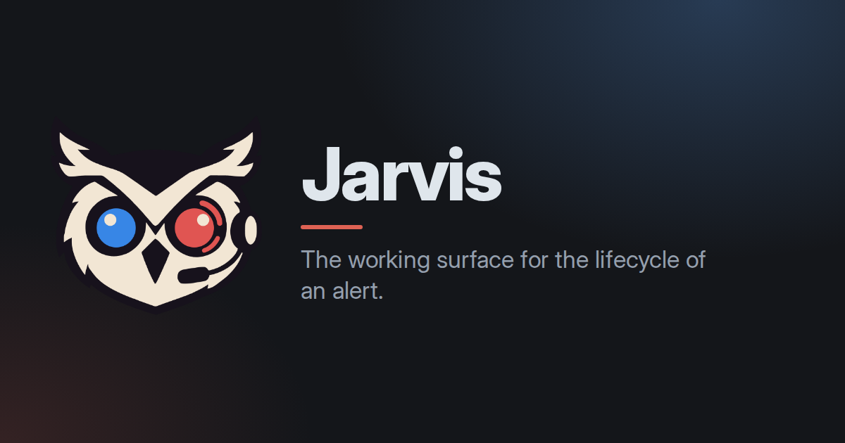
Formats: Open Graph 1200 × 630 (social-og.png, the image the docs site shares), square 1080 × 1080 and slide 1920 × 1080. Logo left, title right (or stacked for the square), a blue glow, one coral accent.
- Every image MUST have alt text that says what it shows, not "screenshot".
Do and don't
| Do | Don't |
|---|---|
Use border-control on a field | Hand-pick border-gray-500 |
Use text-muted-foreground at full strength for meaningful text | Add /60 to it |
Use bg-warning-soft text-warning-fg | Use text-yellow-400, or branch on the theme |
Open a popover from a <button> with aria-expanded | Hang a menu on a hover-only div |
| Give a new state its own status role | Give blue another meaning |
| Derive icons and favicons from the master | Resize the PNG by hand |
Use rounded-control | Use rounded-md |
Reuse owlMesh.ts | Redraw the mesh |
| Answer reduced motion with any new animation | Add an endless loop |
Where the rules are enforced
design/tokens.json→scripts/design-tokens.mjs— the single source of colour and radius values;--checkruns in the pre-commit hook and in CI.scripts/check-design-drift.mjs(hook and CI) — no raw palette classes, colour literals or radius classes infrontend/src; avatar colours and the heatmap ramp are the only allow-listed data visualisation.frontend/src/lib/themeTokens.test.ts— contrast of the focus ring, the field edge and every status role, in both themes.frontend/e2e/functional/none/a11y.spec.ts— axe on the main pages in both themes and the reduced-motion rule.frontend/e2e/functional/none/app-shell.spec.ts,alerts-overview.spec.tsandalert-ack.spec.ts— keyboard behaviour of the header popovers, info hints, dialogs and the Fast-Silence menu.scripts/logo-assets.py --check— the derived logo files match the master.scripts/design-guide-assets.py --check— the illustrations on this page match the tokens and the logo. Both scripts need Pillow.AGENTS.md— the frontend checklist (pointer cursor, noconsole.log, loading and error states, shared utilities) and thedesign-systemskill.