
Jarvis — Features
Alerts
Card View
Alerts grouped by your configured label (severity by default), with inline silence actions; claiming happens in the detail panel.
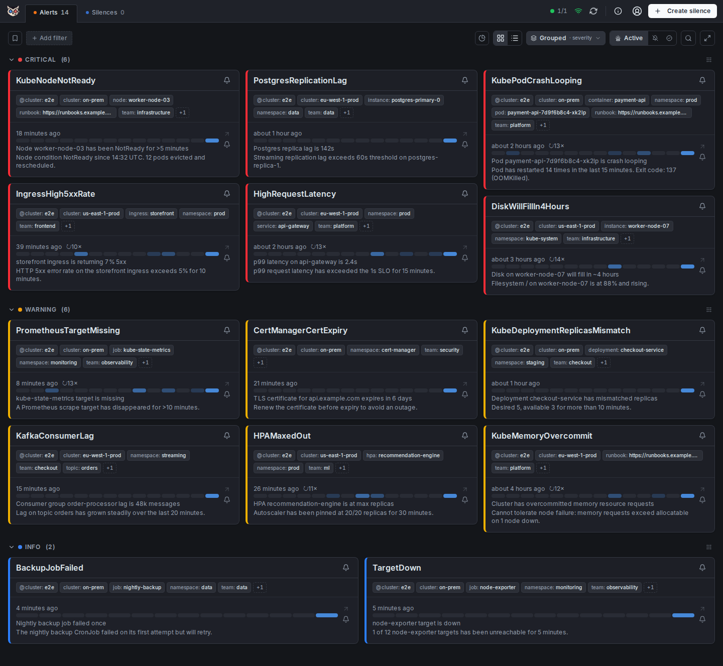
The card view is the default landing page and the primary interface for active alert triage. Each card represents one alert fingerprint and is designed to give you enough context to decide what to do next — without opening a detail panel.
What each card shows:
- Severity badge (critical / warning / info) with color coding
- Alert name and the cluster it originates from
- Labels shared by every alert in a group render once, as a quiet strip above the entries; each entry then leads with its own distinguishing labels (the first one emphasized) instead of repeating the common ones — clickable to instantly add a label filter
- How long the alert has been firing (e.g. "firing for 2h 14m")
- A 14-day firing sparkline under the timestamp — see Firing Heatmap
- Claim line — "Claimed by: <name> · <time>" above the entry, with a blue right accent, if anyone has claimed it
- Comment count — a speech-bubble icon with the number of comments next to the start time, shown only when the alert has comments (see Comments)
Actions available directly on the card:
- Silence / Fast-Silence — a persistent bell icon in a narrow column on the right of each alert entry (and one for the whole group, in the card header) opens a menu with the full silence form and one-click Fast-Silence durations — see Fast-Silence
- Detail — click anywhere on the alert entry to slide open the full detail panel; claim and all other actions are available there
Sections are grouped by a label you choose from the Grouped control in the toolbar (default: severity) — see Grouping below. You can collapse/expand each section and reorder sections via drag-and-drop (drag handle on the right). The section order and collapsed state are persisted in localStorage per grouping label.
Within each section, groups are sorted by recency — the group with the most recently fired alert first, not alphabetically by name — so the freshest problems surface at the top of every section instead of being scattered wherever their alert name happens to sort. The view updates in real time via WebSocket: new alerts appear, resolved alerts disappear, and claim/silence state refreshes without any page reload. If a browser tab falls behind (a slow network, a backgrounded tab) the server closes that stale connection rather than queuing updates indefinitely; the browser automatically reconnects and refetches the current state, so a dropped connection self-heals without user action.
Jarvis never presents missing or old data as if it were current:
- Could not load alerts — if the first load of the Active tab fails, an error with a Retry button replaces the list. It is never shown as "No alerts", which would read as an all-clear.
- Could not refresh alerts — if a refresh fails while data is already on screen, the data stays and a banner above it says so, with Retry.
- Sign-in state unavailable — if the server cannot say whether you are signed in (a 5xx or no connection on
/auth/me, for example during a database outage), Jarvis does not show the login screen. Withfull_protectan error with Retry replaces the page; withwrite_protectornonethe alerts stay readable and a banner with Retry explains that you may appear signed out. A real sign-out (401) still shows the login as usual. - Stale cluster — when a cluster's last good poll is older than three poll intervals (at least 60 seconds), a yellow banner names the cluster and the age of its data: the alerts shown are the last known state, not live.
- Live connection interrupted — if the WebSocket stays down for more than 10 seconds, a yellow banner says Jarvis is reconnecting and that alerts refresh every 60 seconds meanwhile. A connection that silently stops delivering (no close event, for example behind a proxy that drops idle connections) is detected too: the server sends a heartbeat every 54 seconds, and after two missed ones the browser replaces the socket.
Columns: the grid lays out 1–4 columns depending on window width by default. Pin it to a fixed count (1–6) via Card columns in Settings if you'd rather it not reflow as you resize.
Grouping
One toolbar control combines "group or not" with "group by which label" — no detour through Settings to change how alerts are sectioned.
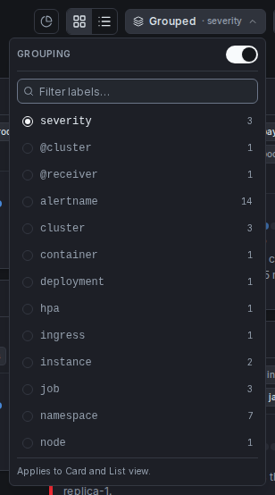
Click the Grouped button in the top-right toolbar (hidden in the Resolved view, which is always a flat list) to open the picker:
- On/off switch at the top — turns section grouping off entirely (Card View falls back to a flat multi-column grid, List View to a flat table) without losing your chosen label for next time
- Label list below it —
severityis always pinned first, every other label seen on the currently visible alerts follows alphabetically, each annotated with how many distinct sections it would create - Filter field — with many labels in play (large fleets easily have 50+), type to narrow the list in real time; the × button resets it
- The list scrolls independently once it grows past a handful of entries, so the popover itself never overflows the screen
The chosen label applies to both Card and List view immediately — no separate setting for each.
List View
Compact table layout with sortable columns — useful when dealing with many alerts at once.
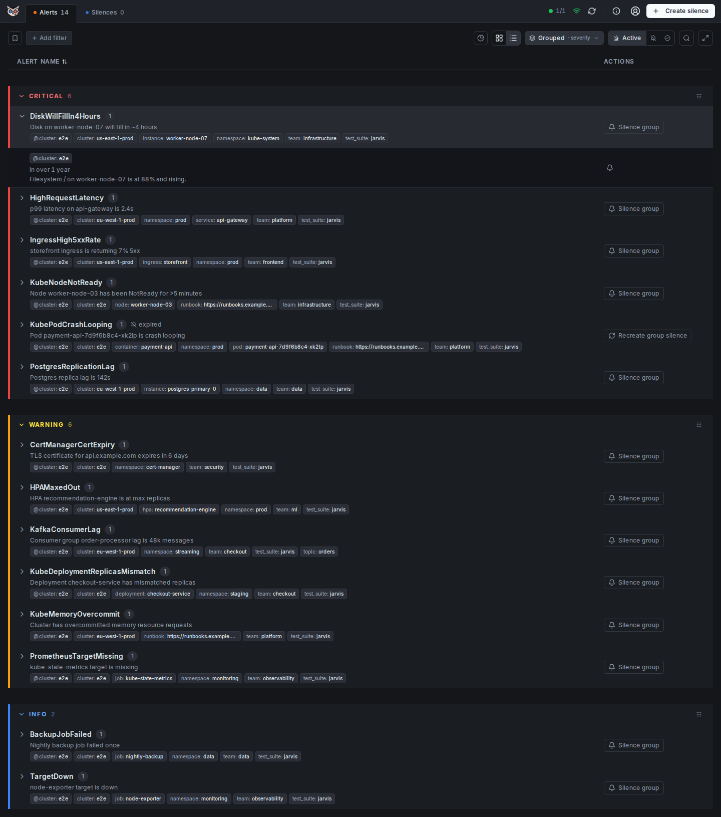
The list view is optimized for situations where you have a lot of alerts and need to scan and sort quickly rather than focus on individual cards. It trades visual weight for density.
Alerts are grouped into sections based on the label chosen in the Grouped toolbar control (severity by default) — see Grouping. Section headers can be collapsed/expanded, and section order can be changed via drag-and-drop.
Within each section, groups are collapsed by alert name. Expand a group to see individual alert instances.
Columns:
- Alert Name — sortable; shows alert count per group, common labels, and cluster names
- State — firing / suppressed / resolved (hidden when a single state tab is active)
- Time — sortable; earliest start time within the group
- Actions — one silence icon (menu: full form + Fast-Silence durations) plus, when the alert is already suppressed, an Extend icon (menu of durations) and an expire icon
A collapsed group header shows a speech-bubble icon with the total number of comments across its alerts, and an expanded alert row shows its own count in its time line, the same as on the card. Alerts and groups without comments show nothing. The count updates live when someone comments, without a page reload.
There is no separate Claim column — a claimed alert shows a read-only "Claimed by: <name> · <time>" line above its labels instead; claiming and releasing happen in the detail panel.
Sorting is available on the Alert Name and Time columns — click a header to sort ascending, click again for descending.
Switching between card and list view is instant. The selected view mode is persisted in localStorage so your preference survives page refreshes, and URL parameters can override it for direct links.
Fullscreen
Hide the header and all controls — only the alert list fills the screen. Useful for wall displays or focused incident response.
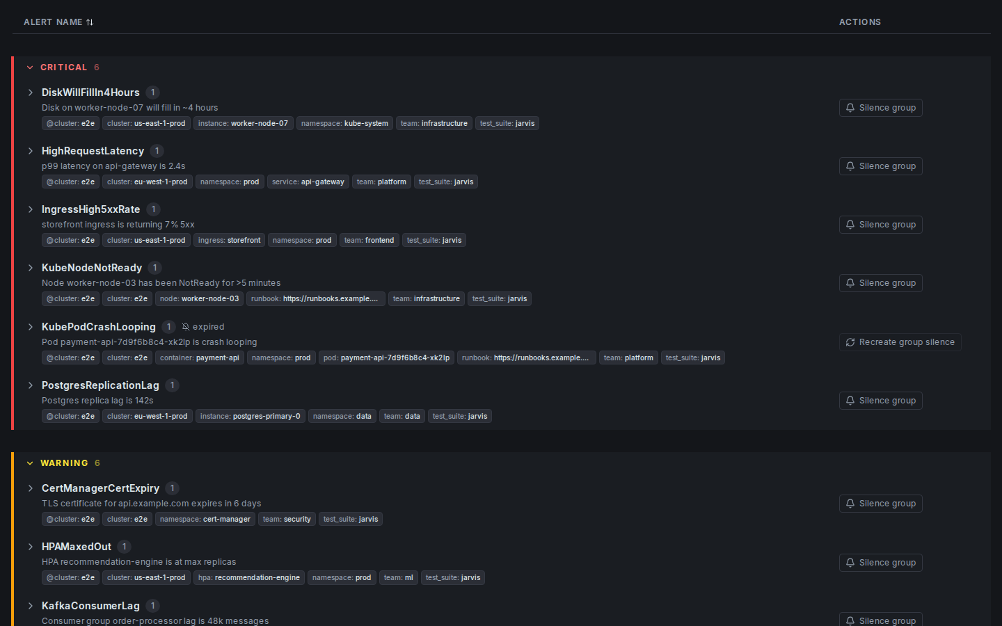
Click the expand icon (⛶) in the top-right corner of the filter bar to enter fullscreen. The main header, navigation, and filter controls all disappear, giving the alert list maximum vertical space.
Press ESC to exit fullscreen and restore the full interface.
Label Filters
Chip-based label matchers (= != =~ !~) that compose into a filter expression and are serialized into the URL for sharing.
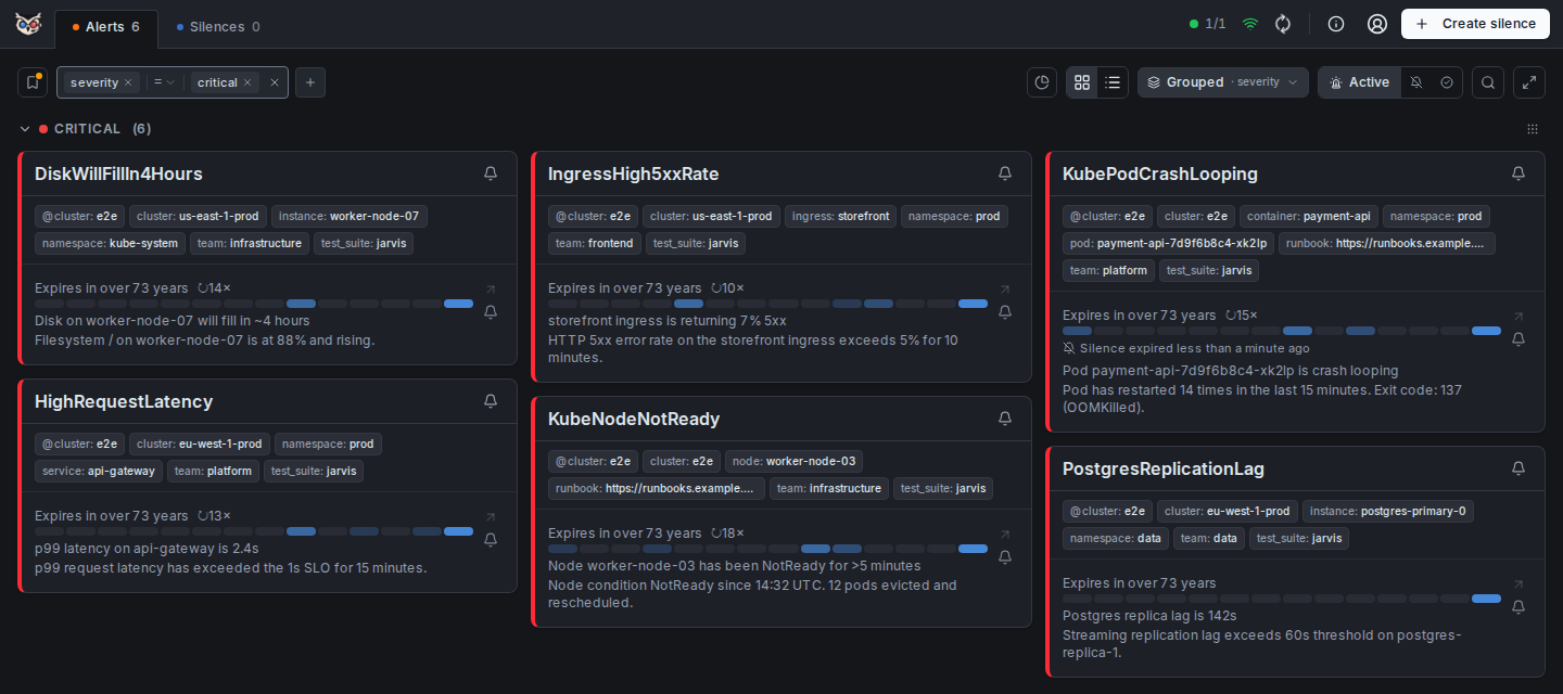
Jarvis exposes the full Alertmanager matcher syntax as an interactive chip UI. You do not need to know or type the syntax — you pick a label from the dropdown, choose an operator, and enter a value. The resulting matcher appears as a chip and is applied immediately.
Supported operators:
| Operator | Meaning |
|---|---|
= | Exact match |
!= | Negative exact match |
=~ | Regex match |
!~ | Negative regex match |
> / < | Older than / younger than — @age only |
Pseudo-fields (not real Alertmanager labels, computed by Jarvis):
| Field | Meaning |
|---|---|
@cluster | Which configured Alertmanager cluster the alert came from |
@receiver (alias receiver) | Alertmanager receiver(s) the alert routes to |
@claimed-by | Who currently has the alert claimed — empty string means unclaimed, so @claimed-by != "" finds every claimed alert and @claimed-by = <name> finds one person's claims |
@age | Time since the alert started firing, compared with >/< and a single-unit duration: @age > 15m, @age < 2h (units: s, m, h, d) |
How filters compose:
- Multiple matchers are ANDed — an alert must match all chips to be shown
- Regex matchers are validated client-side before being applied
- On the Resolved view the history is filtered on the server, whose regex syntax is slightly smaller than in the Active view (no lookaheads/lookbehinds, no backreferences). While a regex filter is set there, an (i) next to the filter bar explains this; a filter the server rejects is marked red
- An
@agechip re-evaluates on every alert-list refresh, so it stays accurate without a dedicated ticker - Clicking a label chip on any alert card instantly adds an exact-match filter for that label
URL serialization: The complete filter state is encoded into the URL as query parameters. This means:
- You can bookmark a filtered view and return to it directly — label filters use Alertmanager's matcher syntax, e.g.
?filter={env="prod",namespace=~"prod-.*"}(the Jarvis pseudo-labels work too:{@age>"15m",@claimed-by=""}) - Older links using the previous
?matchers=[…]JSON format still open and are rewritten to?filter=automatically - You can copy the URL and share it with a teammate — they land on exactly the same filtered list
- Filters survive page reloads and view mode changes
Saved filters

The bookmark button at the left of the filter row lets you save the current set of chips under a name, apply a saved filter with one click, and manage the list — all without opening Settings. Each entry shows its name and, below it, the matchers it contains.
Nothing is saved automatically. The button always tells you where you stand:
| Button | Meaning |
|---|---|
| Bookmark icon only | No chips, or chips that were never saved (a small amber dot marks the latter). |
| Critical (filled bookmark) | The current chips are exactly the saved filter "Critical". |
| Critical (italic, amber dot) | You started from "Critical" and changed the chips — the changes aren't saved yet. Hover for details. |
- Apply — clicking a saved filter's name replaces the current chips with its matchers. Your search text is left untouched, and the result is written to the URL like any manually built filter, so it stays shareable. Re-applying the filter you started from is also how you discard unsaved changes.
- Save changes — after changing a saved filter, the menu shows Save changes to "Critical", plus a field to save the changed chips as a new filter instead. The changed state (and which filter it came from) survives a reload of the same tab.
- Save as new — type a name and press Enter or click Save. A name that already exists (case-insensitive) is flagged while you type.
- Overwrite another filter — when the current chips aren't based on a saved filter (built from scratch, or opened from a shared link), each entry offers a refresh icon that replaces that filter's matchers with the current chips. It needs a second click (Overwrite?) because the old matchers are gone afterwards.
- Rename — the pencil icon turns the entry into a text field: Enter saves, Esc cancels.
- Delete — the trash icon needs a second click (Delete?), mirroring "Reset all settings". The current chips stay as they are.
- Default — the star marks at most one saved filter as the default. It is applied automatically the moment you open Jarvis with no filter, search, state or alert in the link at all — for example a plain bookmark of the home page. It is never applied on top of a shared link, and not re-applied on reload (the reloaded URL already carries your current chips). A default filter's chips are ordinary chips you can remove with ×.
- Saved filters are capped at 20 (the menu shows how many you have) and are stored per user exactly like every other setting — see User Settings below. If saving to your account fails, the menu says so. "Reset all settings" clears them along with everything else.
Filters previously configured as default filters in Settings were converted into a saved filter named Default, marked as the default.
Alerts Overview
A Karma-style breakdown of the current alert list by label value — the fastest way to answer "where is the fire?" when a wall of alerts appears.
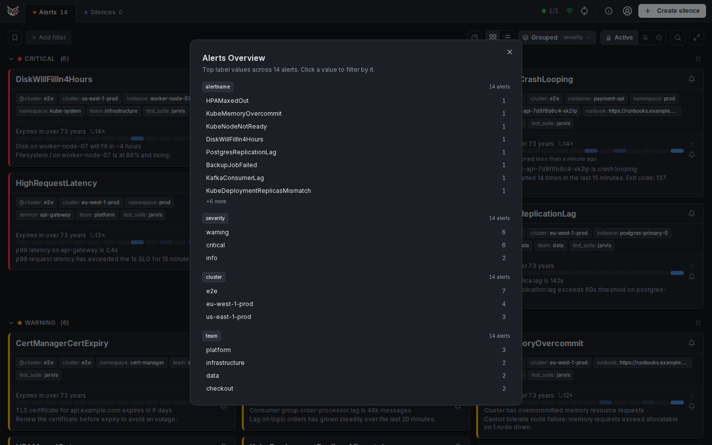
Click the pie-chart icon next to the card/list view toggle to open the overview. For Active and Suppressed it aggregates the current state tab independent of any label filters already applied — the point is discovering what to filter by, not summarizing what's already filtered down. In the Resolved tab it deliberately summarizes only the currently loaded bounded page and labels that scope in the dialog.
Labels are ordered by usefulness: alertname and severity are always pinned to the top, followed by the remaining labels sorted by how many alerts carry them. Each label shows its top 8 values by count, with a "+N more" hint if there are more.
Click any value to instantly apply it as a filter chip — the overview closes and the alert list narrows to that value. Clicking a value that's already filtered is a no-op (no duplicate chip).
Recently resolved
The Recently resolved toggle (the clock icon left of the Active / Suppressed / Resolved switch, shown on the Active tab only) also lists alerts that resolved a moment ago, right in the normal list. It is off by default, so nothing changes until you switch it on, and the choice is remembered in your settings (and follows your account when you are signed in).
Resolved entries are sorted exactly like active alerts, so one sits between the active ones by its start time, and they are marked with a Resolved badge and a muted background. They come from the live snapshot, not from the history, so switching the toggle costs no extra request. A single resolved alert, or a group made only of resolved alerts, is dimmed as a whole; in a mixed group only the resolved alerts are. A mixed group's badge reads e.g. 2 + 1 resolved (active + resolved); position and section counts include the resolved entries. Counters (the number on the Alerts tab, the Active count, the overview) never include them, and a resolved entry takes no part in silencing: there is no Fast-Silence bell, and a group's silence actions only cover its active alerts (a group made only of resolved entries has none). Claiming stays closed for them; comments still work.
How long an alert counts as recently resolved is an instance setting, JARVIS_RESOLVED_BUFFER_TTL (20 minutes by default). Older resolutions live in the Resolved View.
Resolved View
Full alert history persisted in the database (SQLite or PostgreSQL — see docs/postgres-ha.md) — survives container restarts and Alertmanager reconnects.
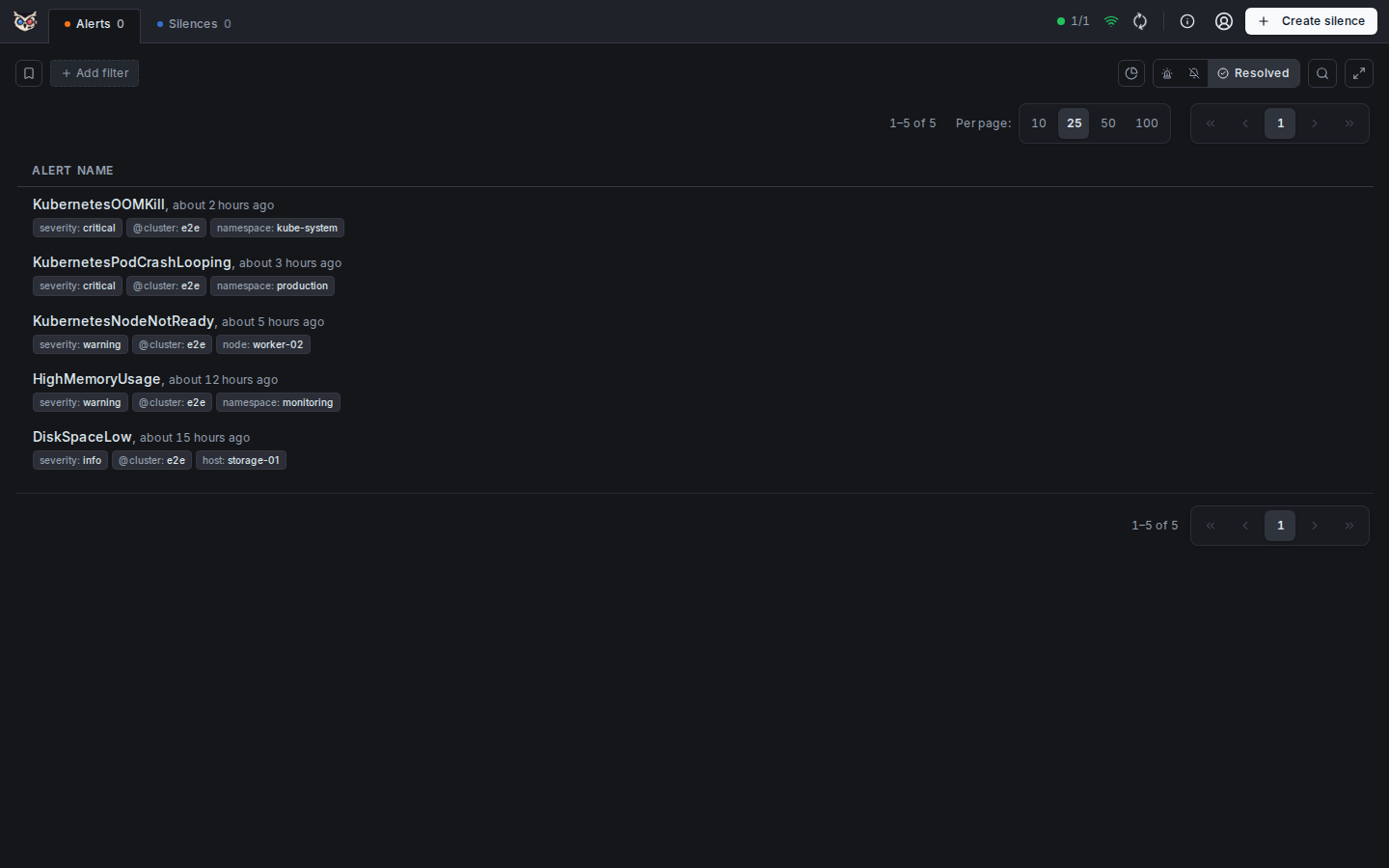
The resolved view is Jarvis's history log. Every alert that has ever fired is recorded in the database with its complete lifecycle, and the resolved view shows all alerts that have reached a resolved state. This is the core capability that separates Jarvis from in-memory-only UIs.
Jarvis loads this database-backed history only when you open the Resolved tab. Active and Suppressed views do not fetch it in the background. Search, label matchers, cluster and severity filters, and the per-page choice all apply to the complete stored history rather than only the visible page.
Alerts are displayed as a flat list in stable newest-event-first order. A right-aligned, grouped page browser at the top and bottom allows navigation through large result sets without crowding the alert list; on narrow screens its controls wrap into stacked rows. The per-page selector (10 / 25 / 50 / 100) sits to the left of the page browser and is persisted in localStorage so your preference is remembered across sessions. Opening a resolved alert that is not on the current page performs one small fingerprint lookup instead of loading the full history.
What is stored per alert:
- First seen timestamp (when it first fired, ever)
- Last seen timestamp (most recent firing)
- Full label set at time of firing
- All state transitions:
firing→suppressed→resolved, with timestamps - Occurrence count across all firings
- Comments and claim history
Why persistence matters:
- Post-incident review: After an incident you can look up exactly when an alert first fired, how long it stayed active, and how many times it re-fired before resolution — without relying on Prometheus or Grafana.
- Noise analysis: Recurring alerts with high occurrence counts are easy to identify and prioritize for permanent fixes.
- Restarts are safe: The history is not lost when Jarvis restarts, when Alertmanager is down for maintenance, or when the container is updated.
- Grace period: If an alert resolves and re-fires within
max(60s, 2 × JARVIS_POLL_INTERVAL)(e.g. due to a missed poll), Jarvis reopens the existing event instead of creating a phantom new one — keeping the history clean. Full lifecycle semantics: docs/alert-lifecycle.md.
Firing Heatmap
At-a-glance history of how often an alert has fired recently — a compact grid, not a full event log.

Every alert's stats line in the detail panel carries a box-grid heatmap: each cell is one time bucket, and darker/filled cells mean the alert fired more often in that bucket — an empty cell means it didn't fire. A 24h / 7d / 30d range toggle switches the bucketing:
- 24h — one row of hourly buckets
- 7d — one row per day, each with 24 hourly buckets (with day labels)
- 30d — one row of daily buckets
Hover the info icon next to the heatmap label for the same explanation inline. Hovering an individual cell shows an exact count and time range tooltip.
A smaller, decorative firing sparkline on each alert card shows the most recent 14 daily buckets under the timestamp row, without competing with the card's own click target:

Both are read-only glance information — there's nothing to click or configure. Data comes from Jarvis's own persisted event history (GET /api/v1/alerts/:fingerprint/heatmap), so it reflects the full recorded lifecycle of the alert, not just what happened since Jarvis last restarted.
Alert Search
Full-text search across alert names and label values — results filter instantly as you type.
The search bar is available in the header on all alert views (active, suppressed, resolved). Entering a search term narrows the visible alerts to those whose alert name or any label value contains the typed string (case-insensitive). Search composes with active label-filter chips — both conditions must be satisfied for an alert to appear.
What is matched:
- Alert name (
alertnamelabel) - All label values (e.g. instance, job, namespace, …)
The search term is not persisted in localStorage or the URL — it resets on page reload, making it a lightweight triage tool rather than a shareable filter. For persistent, shareable filtering use the label-matcher chips instead (see Label Filters).
Detail Panel
Alert Detail Panel
Per-alert drawer with labels, annotations, firing history, occurrence stats, claim ownership, silence controls, comments, and an AI-analysis prompt — organized into tabs.
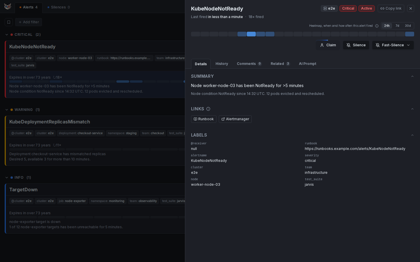
The detail panel is the central hub for working with a single alert. It slides in from the right side of the screen without navigating away from the alert list, so you can open it, take action, close it, and move to the next alert without losing context.
Always visible (above the tabs):
- Alert name, cluster, severity, and claim chip in the header
- Copy link button in the header: puts a link on the clipboard that opens this very alert in the detail panel for anyone with access to Jarvis — paste it into chat or a ticket. The link carries only the alert (and whether to look in the active or the resolved view), never your own search or filters. It also works when Jarvis is served over plain
http - First seen / last seen timestamps and total occurrence count
- Firing heatmap (24h / 7d / 30d range toggle) — see Firing Heatmap
- Active/expired silence banners, if the alert is currently or was recently silenced
The panel is then split into five tabs:
Details
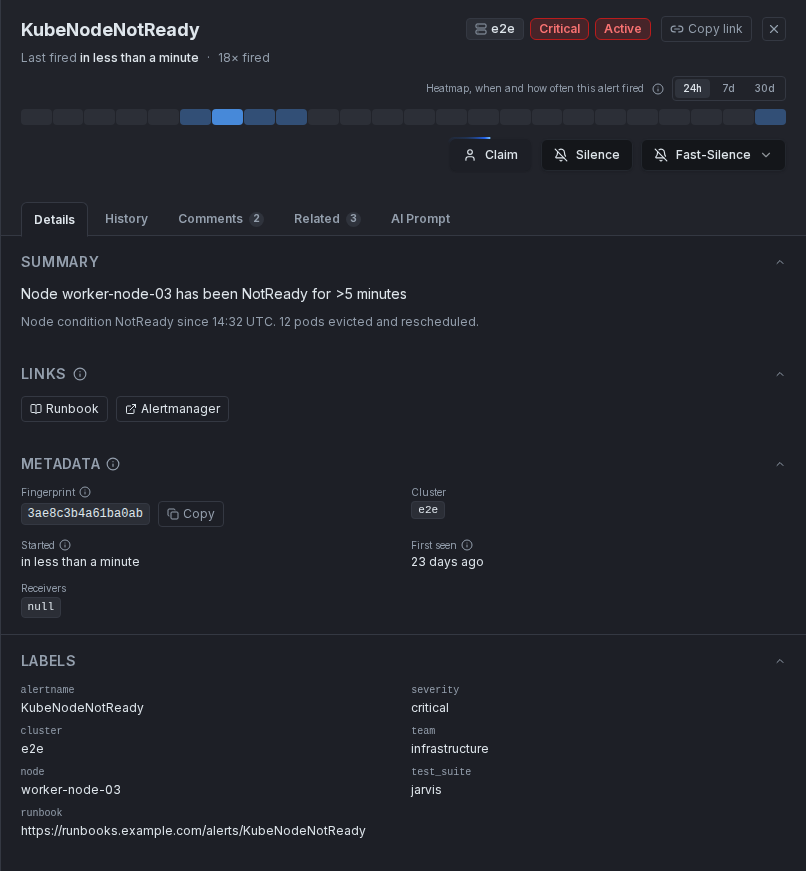
- Complete label set, rendered as key-value pairs
- Metadata section above the labels, in two columns: the alert's fingerprint (the identifier that uniquely identifies it — a hash of its labels, the same value Alertmanager uses — with a copy button for finding it in Alertmanager, the API, or logs), its cluster, when it started and was first seen, the Alertmanager receivers it is routed to, and a link to its source (the rule's
generatorURL, shown only when it is anhttp(s)URL) - All annotations, including
descriptionandsummary - Dynamic link buttons: any label or annotation whose value is an absolute URL (
http://orhttps://) automatically renders as a clickable button using the key name as the label — no configuration needed. Examples:dashboard=https://grafana.example.com/d/abc,ticket=https://jira.example.com/ISSUE-1 - Runbook: the
runbookkey (label or annotation) is handled specially:- If the value is an absolute URL → used directly as the link
- If the value is a plain string and
JARVIS_RUNBOOK_BASE_URLis configured → the final URL isRUNBOOK_BASE_URL+ value (e.g.https://wiki.example.com/runbooks/my-alert); the result must be anhttp(s)URL on the same origin as the base, otherwise no button is shown - If the value is a plain string and
JARVIS_RUNBOOK_BASE_URLis not set → no button is shown
History
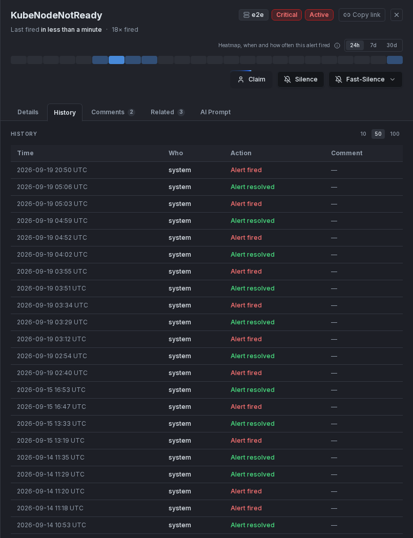
- Full event timeline: every state transition (
firing,suppressed,resolved) with exact timestamps - Merged with claim and silence actions for the same alert, so the whole handling story reads in one place
- Paginated for long-running, frequently-firing alerts
Comments
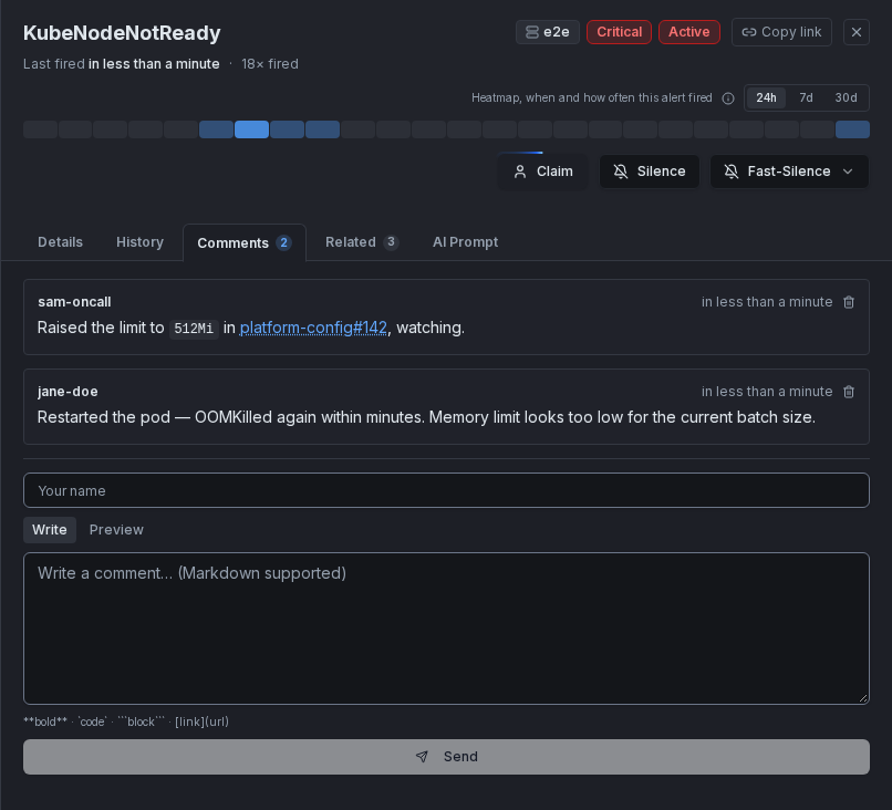
- Write freeform notes bound to the alert's fingerprint — supports Markdown (bold, links, lists, fenced code blocks with syntax highlighting for bash, JSON, YAML, Go, JavaScript, SQL, and INI)
- Comments persist across re-fires: if the alert resolves and fires again later, the comment history is still there
- The tab label carries a count badge, so you can see at a glance whether an alert already has notes without opening the tab
- Useful for documenting investigation steps, linking to tickets, or leaving context for the next person on-call
Related
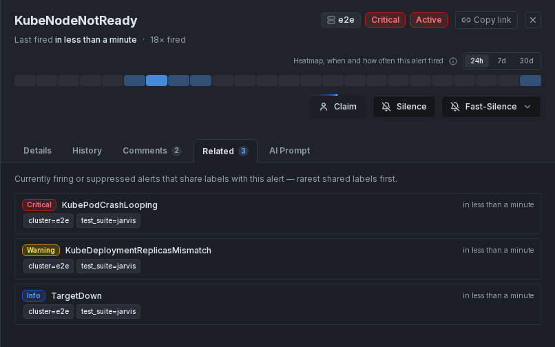
- Answers "is this alert part of a bigger problem?" — lists other currently firing or suppressed alerts that share labels with the open alert, without leaving the panel
- The tab label carries a count badge, so you can spot a correlated incident before even opening the tab
- Each row shows the severity, alert name, the shared labels as chips (most specific first), the cluster name when the related alert lives in a different cluster, and when it started — click a row to jump to that alert's detail
- Results are ranked, top 10 shown first with a Show more button for the rest
How relatedness is computed:
- Two alerts are related when they share at least one label with an identical value — any real label counts (
instance,namespace,pod,job, custom labels likeentityordevice, …) - Not counted:
alertname(fifty hosts firing the same rule is a grouping concern, not a shared blast radius),severity,receiver, and labels whose value is a URL (runbook/dashboard links are metadata, not identity) - Rarity weighting: a shared label value carried by only two alerts (
instance=web3) weighs far more than one carried by half the snapshot (namespace=prod) — common labels devalue themselves automatically, so the top results are the alerts that share something genuinely specific with yours - Time proximity: alerts that started around the same time as the open alert get a score boost — started together usually means same incident
- Cross-cluster matches are included on purpose: the same
instancereported by two Alertmanager clusters is exactly the pattern worth surfacing - The comparison always runs against the current snapshot — even when you open a resolved alert from history, the tab answers "is this still hot elsewhere?"
AI Prompt
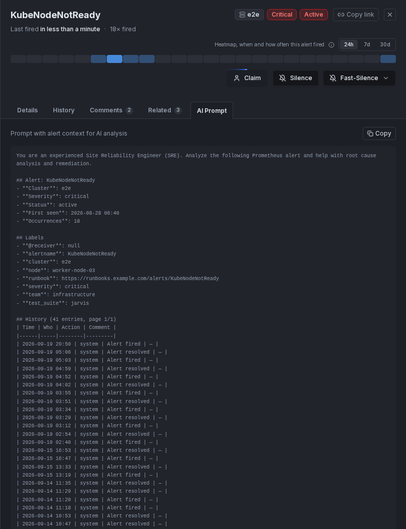
- Generates a ready-to-paste prompt for an LLM (alert name, cluster, severity, labels, annotations, and the recent history table), framed as an SRE root-cause-analysis request
- One-click copy to clipboard — paste directly into Claude, ChatGPT, or any other AI assistant to get a head start on investigation
Claim ownership (available regardless of tab)
- Claim the alert to signal to your team that you are actively handling it
- The claim is stored in Jarvis's database and survives page refreshes and restarts
- Other team members can see who has claimed an alert on both the card and list view
- Unclaim at any time
When an alert is claimed, the owner's name appears as a chip in the detail panel header, and as a "Claimed by: <name> · <time>" line with a blue accent on the alert card (right edge) and list row (left edge). The claim history is recorded in the History tab.
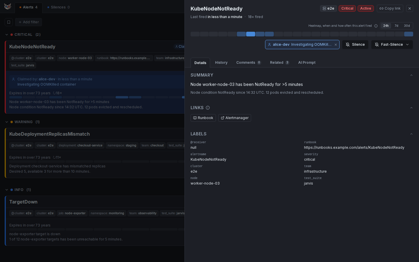
Silence controls
- Create a new silence directly from the panel — the form opens pre-filled with the alert's labels
- Extend (by a duration, see Extend Silence), edit or expire an existing silence if the alert is currently suppressed
Silences
Create Silence
Matcher builder with duration picker and a live preview of which alerts the silence will affect.
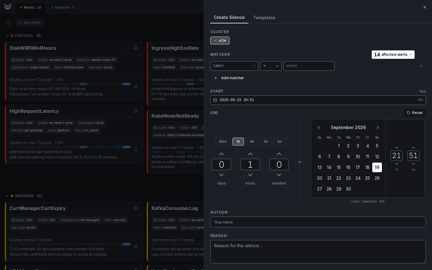
The silence creation form is designed to make it fast and safe to create silences without mistakes. The most dangerous part of silencing is being too broad — silencing more than you intended. Jarvis mitigates this with an interactive matcher builder and a live preview that shows exactly what will be silenced before you commit.
Matcher builder:
- Select any label key from a dropdown populated with labels from your current alerts
- Choose the operator (
=/!=/=~/!~) - Enter the value — regex values are validated immediately
- For
=~/!~, a Values | Regex switch next to the value field sets how the value is read: Values takes one or more exact values (each matches literally, so10.0.0.1never matches10a0b0c1), Regex takes a pattern such asrenovate-.*. Typing a value with regex syntax (*,+,?, brackets,^,$,\) into Values switches the row to Regex automatically; values you already entered stay literal - Add as many matchers as needed; all are ANDed
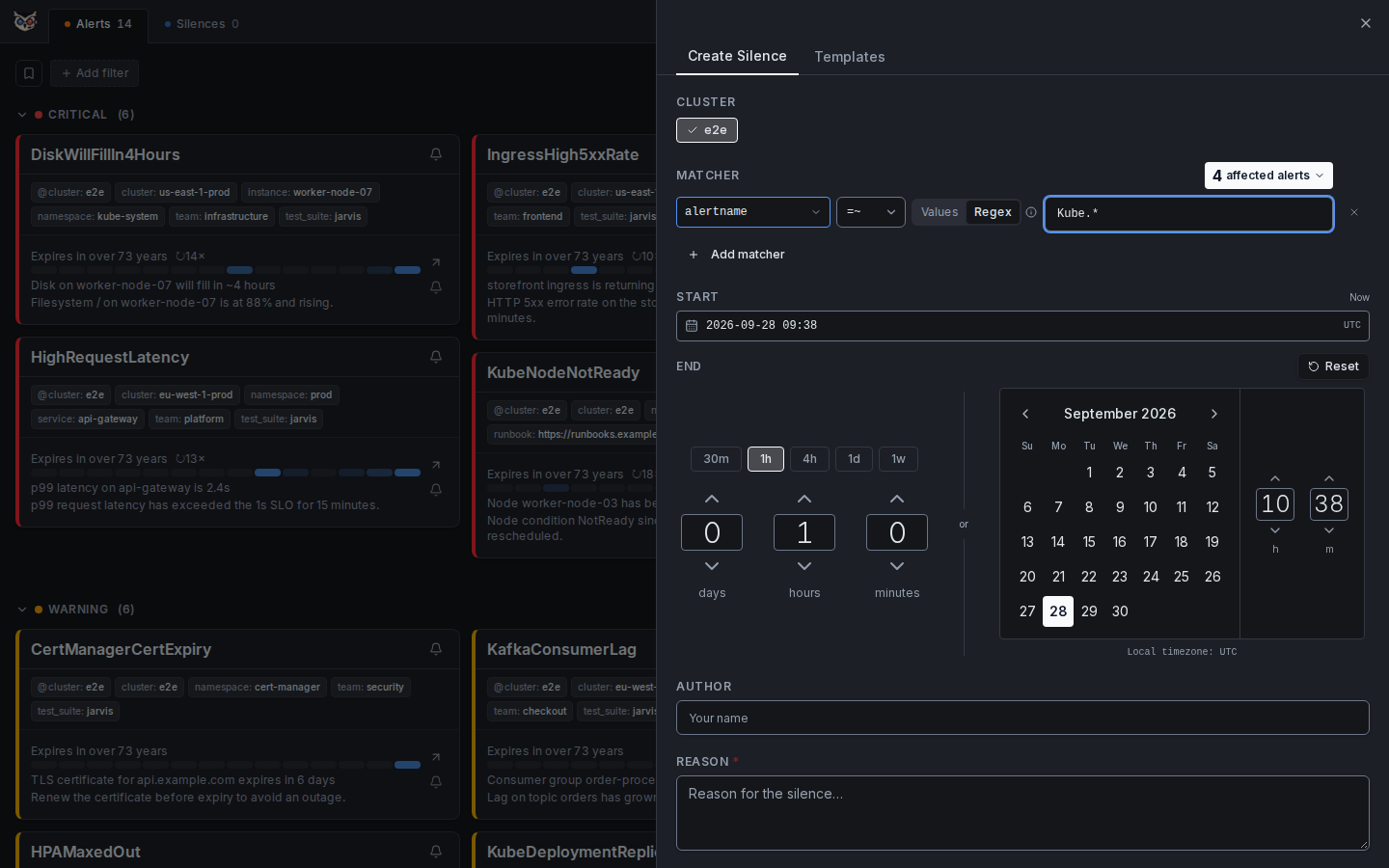
Duration:
- A days / hours / minutes spinner — set any duration you need
- Or switch to calendar mode to pick an exact end date and time
- Start time defaults to now but can be adjusted
Live match count:
- A counter next to the matcher rows shows how many currently firing alerts match — updates as you edit matchers
- Full affected-alert list is shown on the separate Preview step before submitting, so you can verify the blast radius before creating the silence
Silences are sent directly to Alertmanager via Jarvis's API proxy and are effective immediately. No need to open the native Alertmanager UI.
Silence from Alert
One-click silence creation pre-filled from an alert's labels — no manual matcher entry.
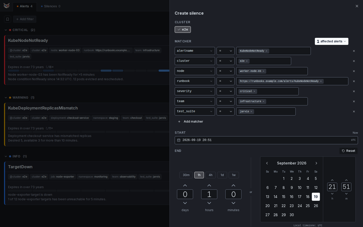
During an active incident, switching to the Alertmanager UI to create a silence costs time and focus. Jarvis eliminates this by letting you create a silence directly from any alert, with all matchers pre-filled.
How it works:
- Open an alert's detail panel (or click "Silence" directly on a card)
- The silence form opens with the alert's full label set pre-populated as exact-match matchers
- Review the matchers — remove labels to broaden the scope, or switch to regex for flexibility
- Set a duration and submit
Common patterns:
- Precise silence: Keep all labels → silences only this exact alert instance
- Broader silence: Remove
instancelabel → silences all instances of this alert - Pattern silence: Change
=to=~on the job label → silences all alerts from a job matching a regex
The live preview updates as you modify matchers, so you always know exactly which alerts the silence will cover before creating it.
Fast-Silence
One-click, form-free silence on any active alert — hover the button, pick a duration.
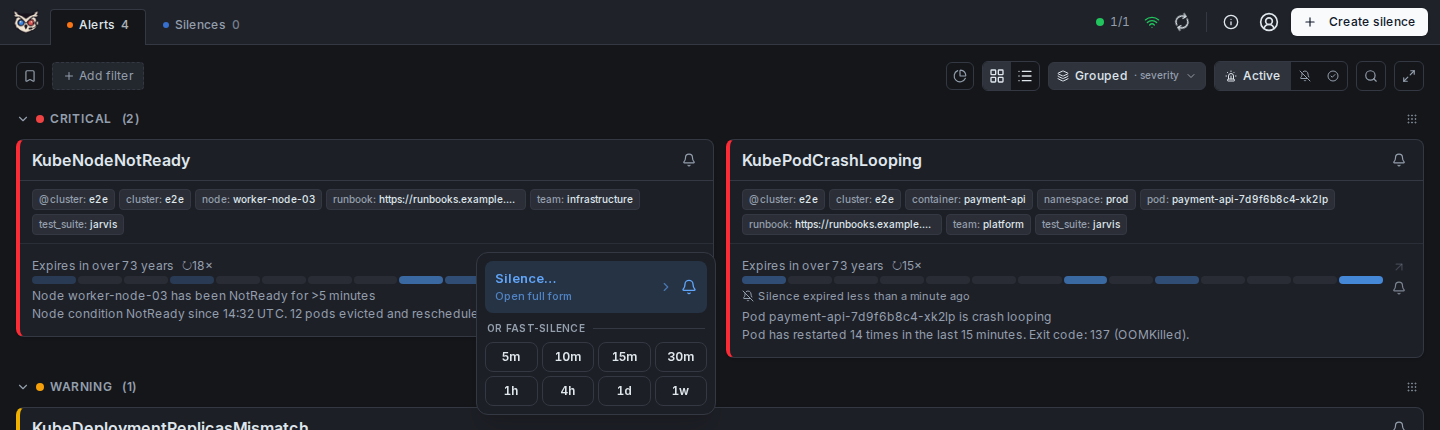
Silence from Alert still requires opening the form, reviewing matchers, and submitting — the right choice when you want control over scope. Fast-Silence is for the common case: you know exactly which alert (or group of alerts) you want to quiet, right now, without leaving the alert list.
How it works:
- In card view, every alert entry has a small bell icon in its persistent action column on the right — no hovering needed to find it. The card header carries the same bell icon for the whole visible group.
- Hovering, tapping, or pressing Enter/Space on the bell opens a popover (tabbing onto the bell does not open it, so moving through a page of cards stays quick): Silence… at the top opens the full pre-filled form (see Silence from Alert); below it, Fast-Silence for… lists durations — by default
5m,10m,15m,30m,1h,4h,1d,1w(configurable, see Choosing the durations below). - Picking a duration on a single alert's bell creates one exact-match silence for that alert's real labels, no form involved. Picking a duration on the card header's bell creates one broader silence per cluster represented in the group (normally just one) — matchers use the same common-vs-varying label logic as the "Silence…" form's own group prefill (exact match on labels shared by every alert, regex-OR match on labels that vary, e.g.
pod), so it covers exactly the same scope a reviewed form submission would default to.
The same bell + menu pattern is also available (without the group case) on list-view rows and in the alert detail panel. Each created silence's comment is auto-filled as Fast-Silence for <duration> so its origin is clear later in the Active Silence view or Alertmanager itself. The button shows a transient "Silenced" confirmation immediately, before the next poll flips the alert(s) to suppressed.
Choosing the durations. The button list is yours to change. Open Settings → Silences: Silence durations shows the current list as chips — remove one with its ×, add one by typing a number plus m, h, d, w or y and pressing Enter (30m, 4h, 1d, 1w, 30d, 1y; between 1m and 365d, at most 12, at least one). Your list is stored with your other settings and only when it differs from the default; Reset brings the default back. The same list feeds the Extend-silence menu and the Default duration of the Create Silence form. The default is set per instance with JARVIS_SILENCE_DURATIONS — so an operator can offer 30d to everyone, while a user who wants their own set still can.
The per-alert bell is only shown while that alert is active (invariant: it disappears once suppressed or resolved); the card header's bell stays available regardless of state, since its "Silence…" form link is still useful for a resolved group, but its Fast-Silence section hides itself once nothing in the group is active. Every path respects the same authentication gate as other write actions — in write_protect mode, picking a duration prompts login first.
Extend Silence
Push the end of a running silence out by a fixed amount — one hover, one click, no form.
The fix is still in progress and the silence is about to run out? Fast-Silence only creates new silences; extending an existing one used to mean opening the edit form and typing a new end time. Every active or pending silence now has an Extend icon (alarm clock with a plus) that opens a small menu with the same durations as Fast-Silence (by default +5m, +10m, +15m, +30m, +1h, +4h, +1d, +1w). The list is configurable — see Choosing the durations under Fast-Silence — so an operator can offer +30d for both menus at once.
- The duration is added to the silence's current end time, not to "now" — so a "+1h" can never shorten a silence that still has hours left.
- It updates the same silence in place (same ID, matchers and comment); only the end moves. With a login, the creator becomes the user who extends; in
nonemode it stays as it was. On an alert, the extension shows up in its silence history like any other silence change. - Available wherever a running silence is shown: the alert card's silence banner, list-view rows and group headers, the detail panel's silence banner, and every silence on the Silences page (card and list view). On a grouped card, one pick extends all silences in the group together.
- One logic for every running silence: a silence that expires within 15 minutes (see Expiring Silence) is extended with the very same menu — its icon is just tinted as a warning. There are no separate quick buttons or forms for that case.
- Expired silences can't be extended in place (Alertmanager creates a new silence for those) — use the re-create action instead.
- Follows the same authentication gate as other write actions: in
write_protectmode, picking a duration prompts login first.
Silence Templates
Reusable matcher sets that pre-fill the silence form in one click — no manual re-entry for recurring silences.
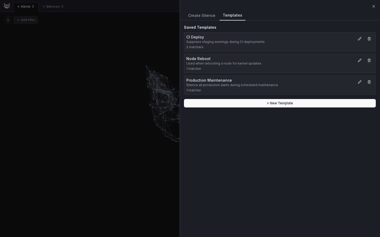
When the same silence patterns come up repeatedly — scheduled maintenance windows, known flaky checks, team-specific noise — it is tedious to re-enter matchers every time. Silence templates let you save a named set of matchers and a reason once, then apply them in a single click.
How to use templates:
- Open the silence creation form via "Create silence" in the header
- Switch to the Templates tab
- Click any template to instantly load its matchers into the form
- Adjust the duration and creator if needed, then submit as normal
Creating and managing templates:
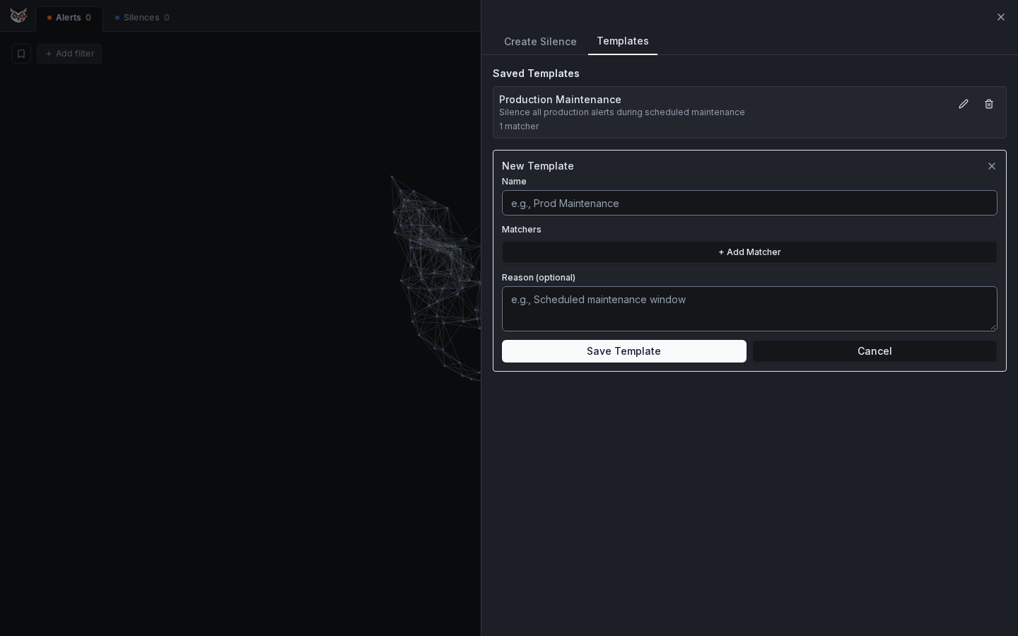
In the Templates tab, click + New Template to define a new one:
- Give it a name (e.g. "Prod Maintenance", "Node Reboot")
- Add matchers exactly like in the silence form
- Optionally add a reason / note for context
- Save — the template is stored in Jarvis and available to all users immediately
Templates can be edited or deleted from the same tab. They are stored server-side in the Jarvis database and shared across all users of the instance.
Why this matters: During an incident the last thing you want to do is look up which label combination to silence. Having a "Node Reboot" template means the matcher for alertname = KubeNodeNotReady is one click away, with the right scope already set.
Expiring Silence
Alerts with a silence that expires within 15 minutes are surfaced as active so they don't catch the team off guard.
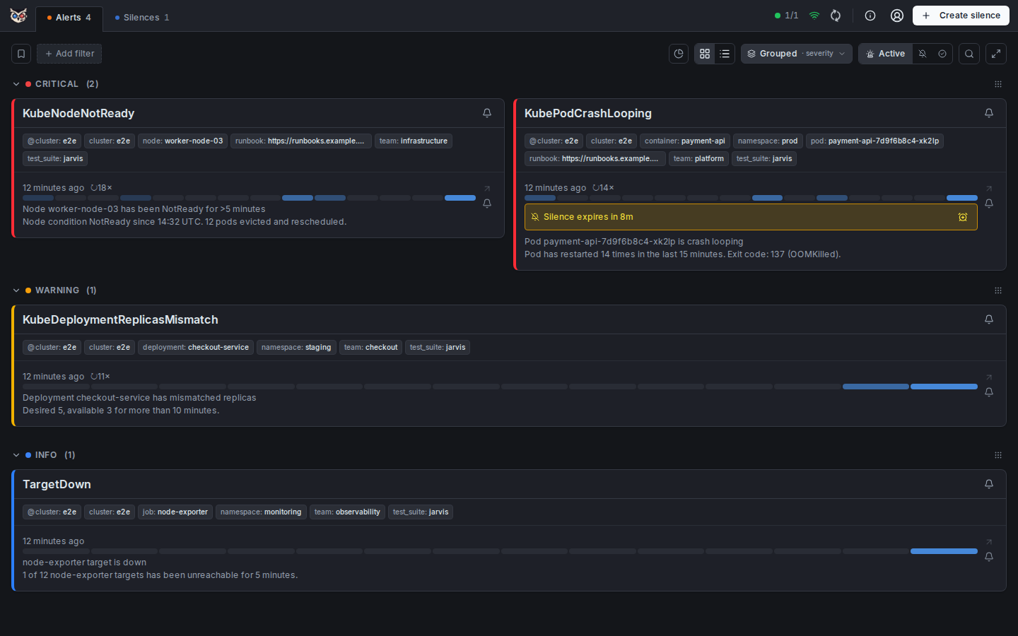
This is one of Jarvis's most operationally important behaviors, and one that does not exist in most Alertmanager frontends.
The problem it solves: You create a 4-hour silence during an incident and fix the underlying issue — but the fix turns out to be incomplete. The silence expires, the alert re-fires, and the on-call engineer gets paged. In a noisy environment this is easy to miss, especially at 3am.
What Jarvis does: Any alert that is currently suppressed but whose covering silence expires within 15 minutes is automatically reclassified as active and moved to the top of the active alert list. A distinct warning indicator shows that the alert is "expiring soon" rather than freshly firing.
This gives the on-call engineer time to:
- Extend the silence if the fix is still in progress — with the same menu as for any other running silence
- Verify that the underlying issue is actually resolved
- Hand off context to the next person before going off-call
The 15-minute threshold is intentional: long enough to act, short enough to not cause premature noise. The reclassification logic runs entirely in the frontend (lib/alertUtils.ts) and updates in real time as silences approach expiry.
Active Silence
Suppressed alerts show the exact silence that covers them, including remaining duration.
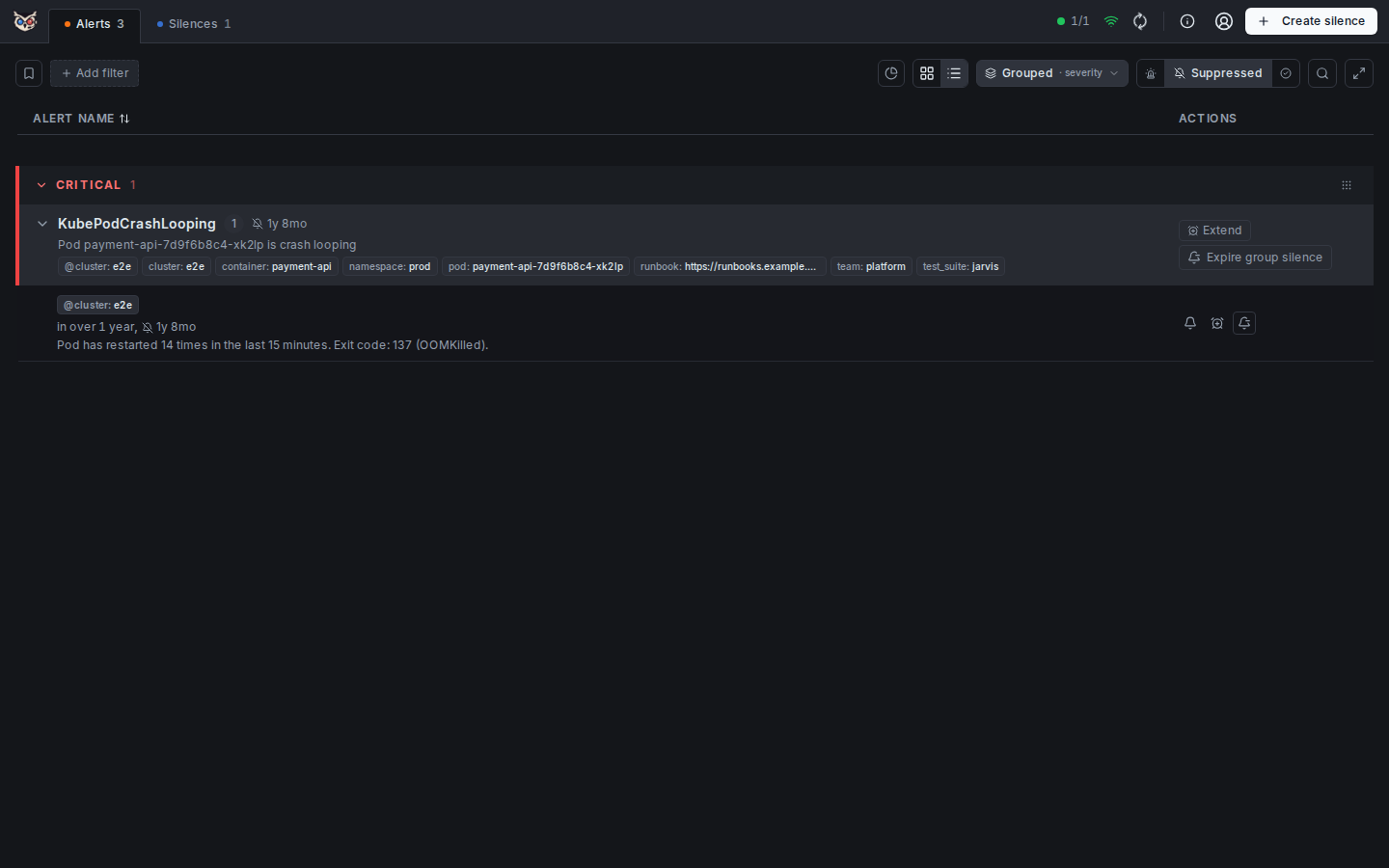
When an alert is suppressed, the question "why is this not firing?" should have an immediate, visible answer. Jarvis surfaces the complete context of the covering silence directly on the alert.
Suppressed alerts (covered by a silence with more than 15 minutes remaining) are accessible via the URL parameter ?state=suppressed. Alerts whose silence expires within 15 minutes are automatically surfaced in the Active view — see Expiring Silence.
What is shown for each suppressed alert:
- Silence ID — with a direct link to edit it
- Matchers — the exact matchers that cover this alert, so you can understand the scope
- Created by — who created the silence and when
- Comment — the reason/note left when the silence was created
- Expiry countdown — how much time is left before the silence expires, updated in real time
- Actions — extend (pick a duration), edit or expire the silence
Why this matters: In teams with multiple on-call engineers or frequent handoffs, it is common to find an alert suppressed by a silence that nobody on the current shift remembers creating. Surfacing the full silence metadata directly on the alert makes it immediately clear what is covered, why, and for how long — without any additional navigation.
Settings
User Settings
Per-user preferences — stored in your account when you're signed in, or in this browser when you're not. Either way, no server config is required.
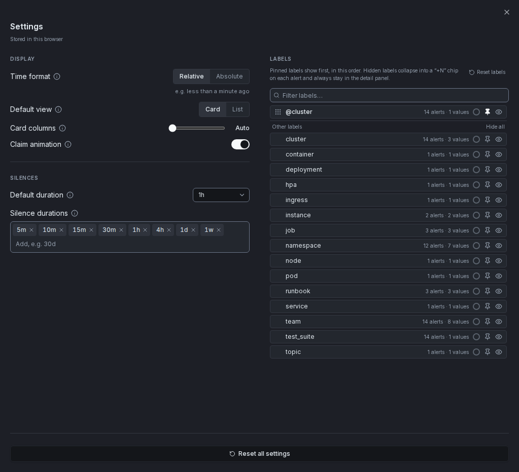
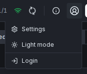
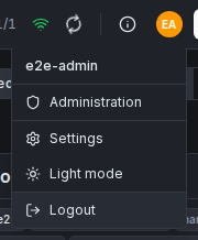
Open the Settings panel from the user-menu button in the top-right of the header (initials avatar when logged in, a generic account icon otherwise) → Settings. The same menu also holds the theme toggle and, when authenticated, login/logout and the admin panel — hover the button to open it. Settings apply immediately without a page reload. While the panel is open, settings=open is kept in the URL, so reloading or sharing that URL opens Settings again.
Where settings live: if authentication is enabled and you're signed in, your settings are saved to your account and follow you across devices and browsers. If there is no login configured at all, or you simply haven't signed in yet, settings are saved to this browser only — a small status line under the Settings heading always says which is the case. You can still open Settings and change anything while signed out (a write_protect deployment lets anyone look around without an account); those changes just stay local to that browser instead of syncing. The first time you sign in on a device with local changes already made, those changes are copied to your account once — after that, your account's settings always win. Signing out falls back to whatever this browser had before you signed in; it does not touch or delete your account's settings.
| Signed out | Signed in |
|---|---|
 |  |
Logging in never costs you your place: when a write needs a session — because you were not logged in, or the session expired while you worked — the login opens on top of the current page and the action you started (for example creating a silence you just filled in) completes right after. With SSO the login runs in a popup so the page stays untouched. Details in User Authentication.
Account (SSO). Signed in with SSO, your name at the top of that menu opens an Account dialog: username, e-mail, role and — when the operator has set JARVIS_OIDC_GROUPS_CLAIM — the groups the identity provider reported. A Copy button puts the groups on the clipboard, handy when you are asked which groups you are in. They are the groups of your last login: a change in the identity provider applies after you sign in again.
Settings and the theme toggle are always there either way; Login only appears signed out, Logout (and Administration, for admins) only signed in. In auth mode none there is no Login entry at all — see User Authentication.
Available settings
| Setting | Description |
|---|---|
| Time format | Switch between Relative ("6 days ago") and Absolute ("Jun 4, 2025, 12:30 PM") timestamps. A live preview updates as you toggle. |
| Default view | Choose whether the app starts in Card or List view on every page load. |
| Card columns | Fixed column count (1–6) for the Card View grid, or Auto to let it reflow with window width (up to 4). |
| Claim animation | Toggle the animated snake border on the Claim button for unclaimed alerts. |
| Default silence duration | Pre-selected duration when the silence creation form opens — pick from your silence durations. |
| Silence durations | The durations of the one-click Fast-Silence menu, the Extend-silence menu and the default duration above, as one tag field — removable chips plus an input, Enter adds (30m, 4h, 1d, 1w, 30d, 1y; 1 min to 365 days, at most 12). Reset restores the instance default (JARVIS_SILENCE_DURATIONS) or, without one, the built-in list. |
| Labels | Pin the label chips you care about to the front, hide the ones you don't, and optionally give a label a color — see below. |
Which label sections Card and List view group by is no longer a Settings entry — it moved to the Grouped toolbar control, see Grouping. The resolved-view page size is set from its own per-page selector, not from this panel — see Resolved View. Reusable label filters are no longer a Settings entry either — see Saved filters above.
Label display
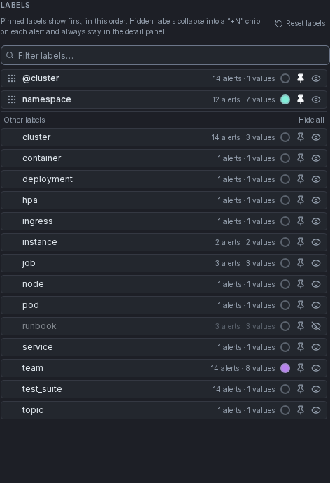
By default every label on an alert renders as a chip. When alerts carry many labels (customer, hostname, instance, dbid, …), that gets cluttered — Settings → Labels lets you pin the labels you care about so they lead every card and list row (e.g. customer → hostname → job), and hide the ones you don't need. The Settings panel is two columns — Display and Silences on the left, Labels on the right.
Labels is one list, every row the same: label name, how many alerts carry it and how many distinct values it has, a color swatch, a pin and an eye.
- Pin — pinned labels move to the top of the list and render first on every alert, in that order. Drag the grip handle to reorder them; click the pin again to unpin.
- Hide — the eye collapses a label into a small +N chip at the end of each alert's chip row. A hidden row stays in its alphabetical place, dimmed. Pinning a hidden label shows it again, and hiding a pinned label unpins it — a label is either pinned, normal or hidden.
- Color — labels are neutral by default. The swatch opens a small palette (eight colors, each tuned for both light and dark theme); pick one and every chip for that label key gets it — card and list view, related alerts, the alerts overview, and silence matcher chips. Color is per label key, not per value.
- Hide all / Show all — above the unpinned labels; hides or shows every label that isn't pinned in one click. Handy with many labels: pin the few you care about, then Hide all the rest. With a search active it only affects the matching labels.
- Filter labels… narrows the list in real time (reordering is available again once the filter is cleared).
- Reset labels — requires a second confirmation click, then resets only this section (pinned, hidden and colors). The "Reset all settings" button at the bottom of the panel resets everything.
This only changes chip display in the Card and List views (including the shared-label strip above grouped alerts) — it never affects filtering, silence matching, or the affected-alerts preview, and the alert detail panel always shows every label, hidden or not. A label that isn't configured (including one from an alerting rule added after you set this up) simply sorts alphabetically behind the pinned ones and is shown until you hide it — it never changes your existing setup on its own. Every label that isn't hidden is shown. A configured label stays in the list even while no alert currently carries it.
Click an alert's +N chip to open its hidden labels in a small floating layer (hover the chip first to see which ones, without opening it); click elsewhere or press Escape to close it again. It opens as a layer rather than growing the card in place, so it never shifts other alerts around in the card view. This is a per-alert, view-only peek — it never changes your settings.
Dark / Light Theme
Switch between dark and light mode at any time; the preference is persisted in localStorage.
| Dark Mode | Light Mode |
|---|---|
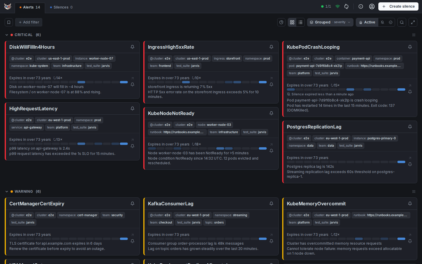 | 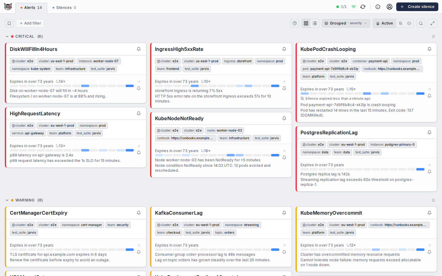 |
The theme toggle is located in the top-right corner of the header. Clicking the icon switches the entire UI between dark and light mode instantly — no page reload required.
The selected theme is saved in localStorage and restored on every subsequent visit. Dark mode is the default when no preference has been saved.
Keyboard and Accessibility
The header's popovers — cluster status, refresh hint, About and the user menu — open on hover and are equally operable from the keyboard: focus the button and press Enter or Space to open or close it, Escape closes it and returns focus to the button, and moving focus elsewhere closes it. The refresh hint appears when the button receives focus. When the live connection drops, the header says "Offline" in text next to the icon, not only by colour. In the cluster popover, tabbing to a cluster name reveals its = / != filter choices. When a cluster's data is stale — Alertmanager has not answered for more than three poll intervals (at least 60 seconds) and Jarvis shows the last known alerts — the instance dot turns yellow and the cluster's row says "Stale · 10 min ago"; a cluster that is down at the same time keeps the red dot.
On an alert card, clicking anywhere on an entry opens its detail panel; from the keyboard the same panel opens through the Open details arrow button in the entry's action rail, which names the alert it belongs to. The card itself is not one large button, so the Fast-Silence and label controls it contains stay individually reachable and are announced separately. In the list view a row opens its detail panel on Enter when the row itself is focused; pressing Enter on a button inside the row (Fast-Silence, a label chip) does only what that button does.
The Fast-Silence and Extend-silence popovers work the same way as the header's: Enter or Space on the bell opens it, Tab moves into its options, Escape closes it and returns focus to the bell.
Keyboard focus is shown with a 2 px blue ring that keeps at least 3:1 contrast against every surface in both themes, and text fields and selects have an edge that meets the same ratio. With the operating system's reduce motion setting on, transitions and decorative animations (pulsing indicators, the claim spinner) are switched off; loading spinners keep turning because they are the only progress signal.